The science of data visualization
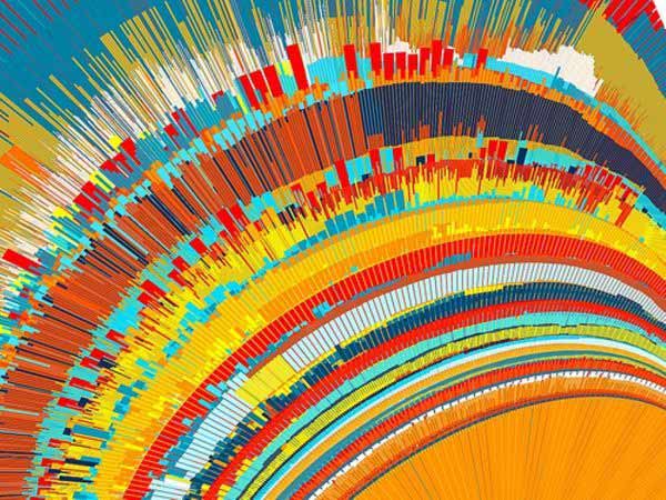
When we think of data visualization, we think of the process of presenting data in a simple, yet visually attractive way. To successfully show data, you have to create images that talk and communicate relationships between the data and the viewers. This can be achieved by using a systematic mapping.
The systematic mapping helps establish how the values of the data will be presented visually. This can be achieved with plots, graphics, bars, lines and other tools.
What does effective data visualization contain?
There are several characteristics successful data visualization should have. When you present complex data, you have to communicate them with clarity, precision and efficiency. That is why, graphic display should have to:
1. Make large data sets coherent
2. Avoid distorting what the data has to say
3. Encourage the eye to compare different pieces of data
4. Serve a clear purpose
How is data collected and processed
There are two defined methods for gathering and processing information.
System 1: This is a method that puts a focus on thought processing. That has to be automatic, fast and unconscious. It has real-life applications.
It helps achieve:
• Solving mathematical problems. Typically problems which are simple by nature. For example it calculates how much is 1+1
• Reading signs
• Differentiating between colors
• Identifying sounds and their sources
System 2: This is a method that concentrates on slow and logical thought processing. This method is most commonly used for solving more complex calculations, such as:
• Understanding the difference between two or more signs.
• Reading different and complicated social cues
• Reciting phone numbers
• Solving complex mathematical problems.
Visual perception and data visualization
It is a known fact that humans react faster to visual cues than to textual or auditory. It doesn’t take a lot of processing effort to differentiate between shapes, sizes, distances, colors and lengths. This is also known as a pre-attentive attribute.
It might take you some time and hard work to identify some set number in a series of numbers. If that same number somehow stands out from the rest, you will be able to find it faster.
They key to an effective graphic is to take advantage of the pre-attentive processing to draw attention to a significant point. Humans are able to process length differences faster than surface areas. If you want to efficiently show data, use a bar chart rather than a pie chart.
Data visualization is a science based on human perception. If you want to design an intuitive visualization, you have to have some knowledge of how human cognition and perception works.
The human visual processing is used in graphics when you want your viewers to detect changes. You want the person you’re showing the data to, notice the difference between sized, shapes, quantities and variations in lightness. Your data should be mapped according to human visual properties. That is how one is able to browse through enormous amounts of data.
When you’re visually processing data and other information, 2/3 of the brain’s neurons are involved and activated. If you want your data visualization to be successful, you have to provide a different approach to show connections and relations.
Traditionally, data was showed in tables and texts. This required conscious thinking to do the work. What data visualization does is shift the balance and the cognitive load to a more automatic response.
The whole idea behind data visualization is to drive responses that are more emotional, subconscious, automatic and habitual.
An essential part of designing impressive data visualization is to understand the key elements of the human cognitive process and the human perception. You have to be mindful of the human brain’s visual perception process to create fundamental design principles.
Designers have to know how the brain transforms images into patterns. If they pay attention to these principles, they will be able to achieve a more explicit visual hierarchy. They will be able to devise data visualizations and to design more effective charts.