R: Dataset "AirPassengers" - Test your skills (Part 2)
Did you try the first "Part" of this dataset included in R?
If no, then please have a look here: https://data-science-getting-smarter.rocks/r/dataset/airpassengers-1/
Make sure that the data is loaded:
Let's first run a summery on our dataset which will help better understand the visual boxplot:
Values:
Min. 104.0
1st Qu. 180.0
Median 265.5
Mean 280.3
3rd Qu. 360.5
Max. 622.0
Boxplot is a method for graphically depicting groups of numerical data through their quartiles. Box plots may also have lines extending vertically from the boxes (whiskers) indicating variability outside the upper and lower quartiles, hence the terms box-and-whisker plot and box-and-whisker diagram. (From Wikipedia https://en.wikipedia.org/wiki/Box_plot)
Try this:
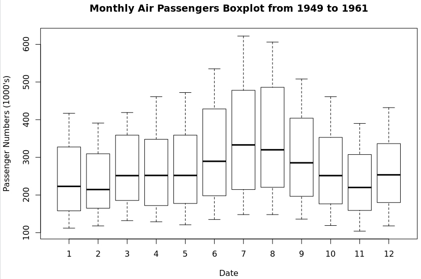
- We can see that in the months 6, 7, and 8 there was an increase in passengers which indicate that the main vacation period is started
- If you look at the Min. then we have 104.0 and it looks about right for our plot and the same goes for the rest of the numbers from our summery(AP) and the plot
- The tails(dash lines) are the low and high numbers of each given month and you can see that they are increasing for each month. This have to do with living style change and the increasing middle class with more opportunities
- There are no data outliners or missing data
This is it for the test of AirPassengers dataset which is included in R.